Published / 5 years ago
Icons and Accessibility
Designing for everyone is an important part of good usability. This website provides a growing list of examples of both good and bad UI solutions for the colorblind.
We Are Colorblind
Making sure your app or website is accessible to all isn’t just ethical, in a lot of cases ADA compliance is the law. The website wearecolorblind.com aims to provide helpful resources and examples for interface designers to keep in mind the needs of all users.
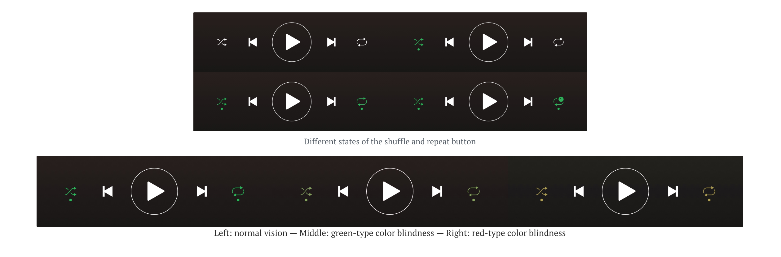
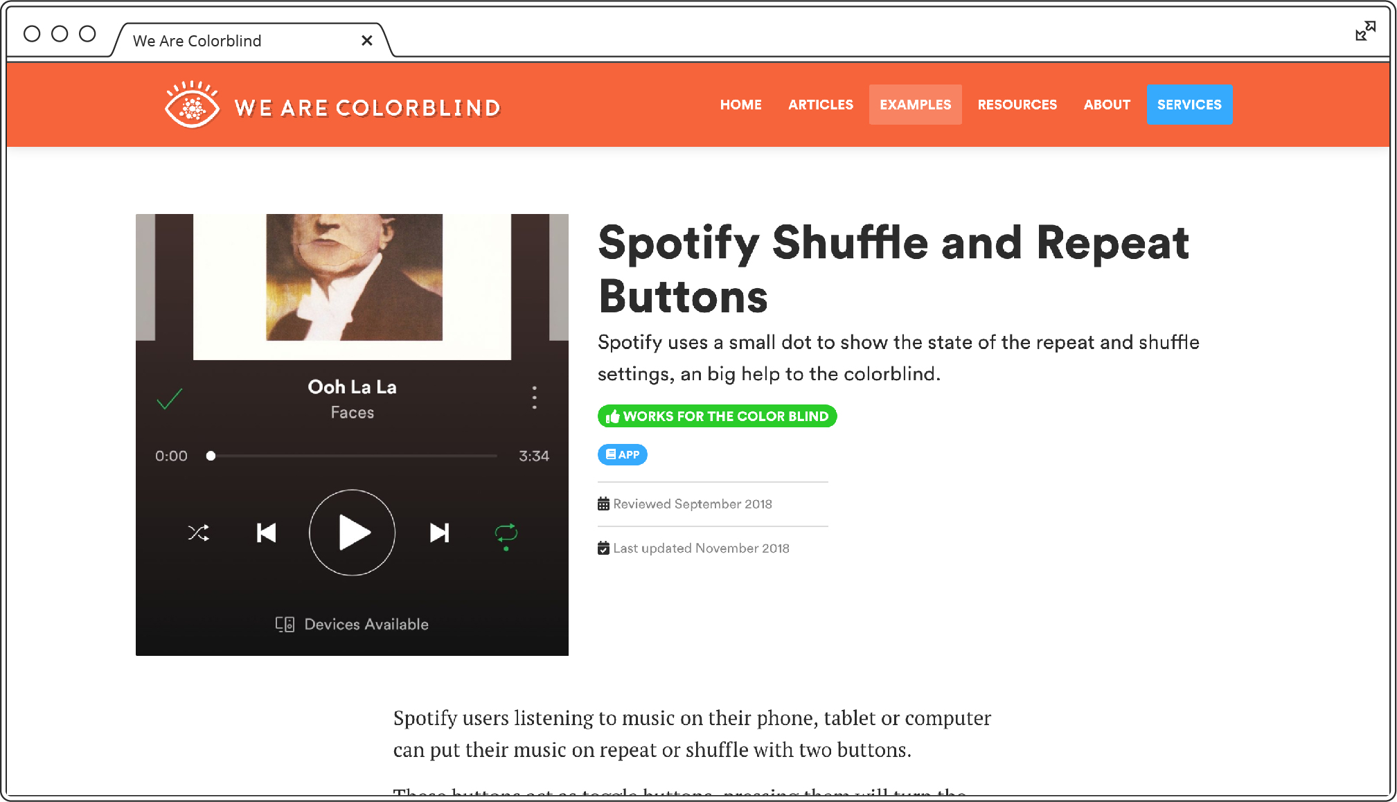
One particularly great example was an article about how Spotify uses a dot underneath their shuffle and repeat icons to indicate selected states on both the desktop and mobile app. Just changing the color alone was not enough to indicate to colorblind users the active state, but this simple dot addition was an effective way to convey the visual information to this audience.
Stark Plugin
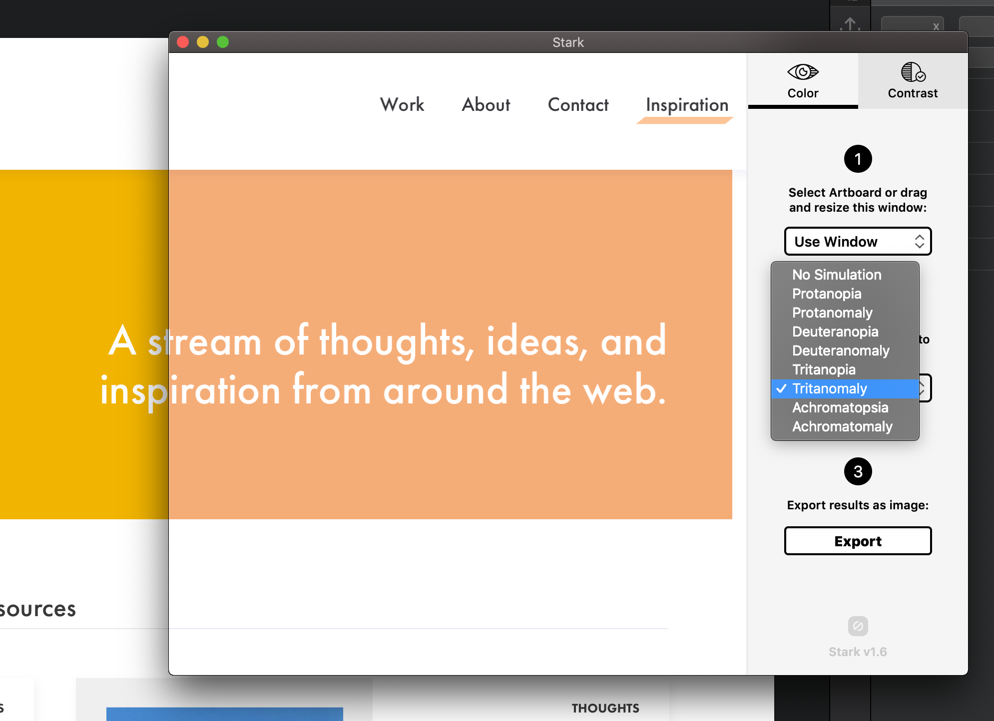
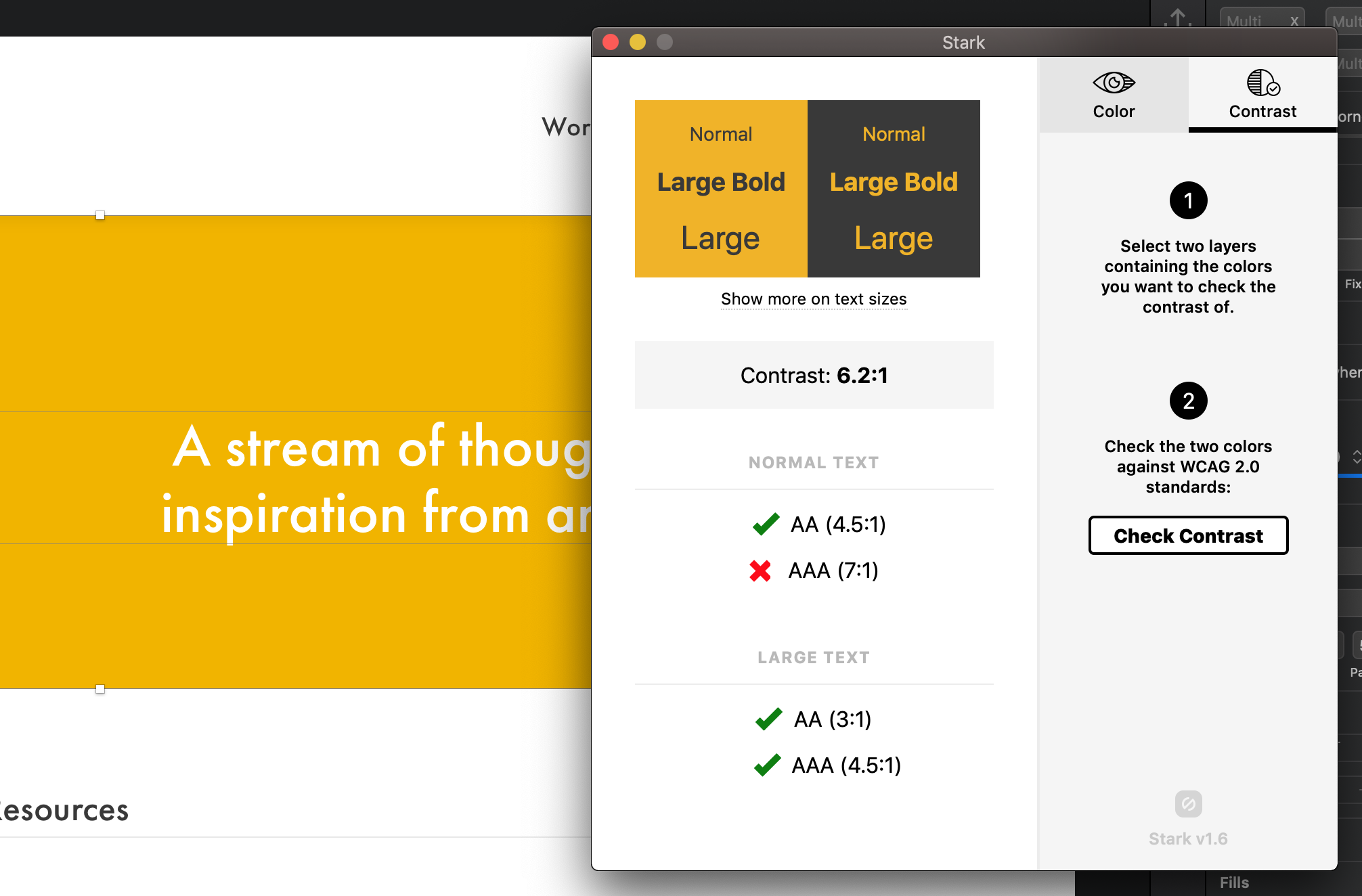
Another tool I love to use during the design process is the Stark Plugin for Sketch (also available for Adobe XD). It allows you to quickly preview designs with different types of colorblindness and get feedback on ADA compliance for contrast ratios.
Learn more at getstark.co