Published / 5 years ago
Empty States
I love a clever empty state. They show great UX thought in providing users with valuable feedback and at the same time keeping the overall app experience both memorable and enjoyable. Users also generally assume that if you’re paying attention to the little details, that you are also paying attention to the big ones (and this is usually the case).
Empty states are a great way to push users out of a potential dead-end in an app where there can be significant terminal drop-off. It’s often surprising if you really break down an app and look at all the places empty states can occur, not just in the early registration points. One best practice (although it’s not always implemented) is giving users a call to action button that triggers the next required step, this keeps them from having to hunt down the menu item you are already giving them instructions to click.
If you are unfamiliar with empty states, or want to learn why they can be so beneficial, this is a great high level view by the team at InVision. The article also includes great stats for when you’re trying to sell your project lead on additional time to accommodate empty states like, “the average app loses 77% of its daily active users (DAUs) within the first 3 days post-install.” Empty states help onboard users and prevent that early drop-off.
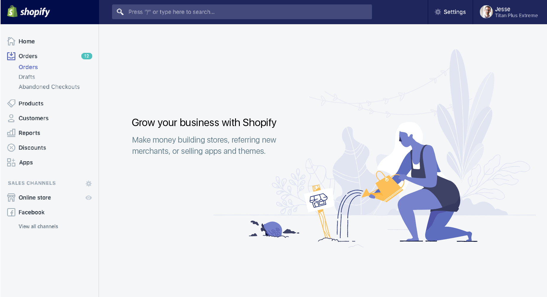
One really great breakdown of empty states is by a member of the Shopify team who put together possibly the most elaborate empty state system I’ve ever seen by creating 39 unique illustrated empty states based on subsets of their 9 core user personas.

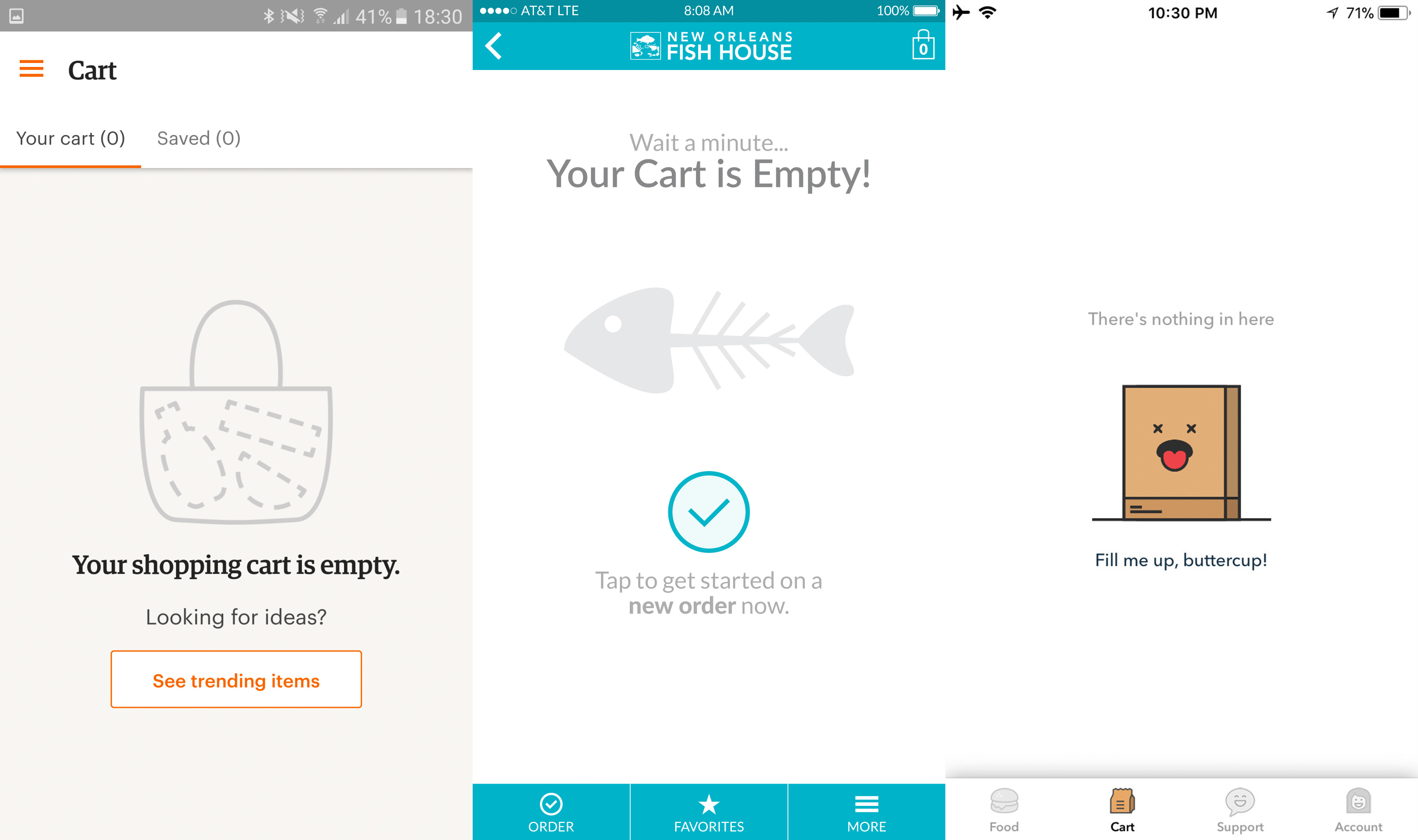
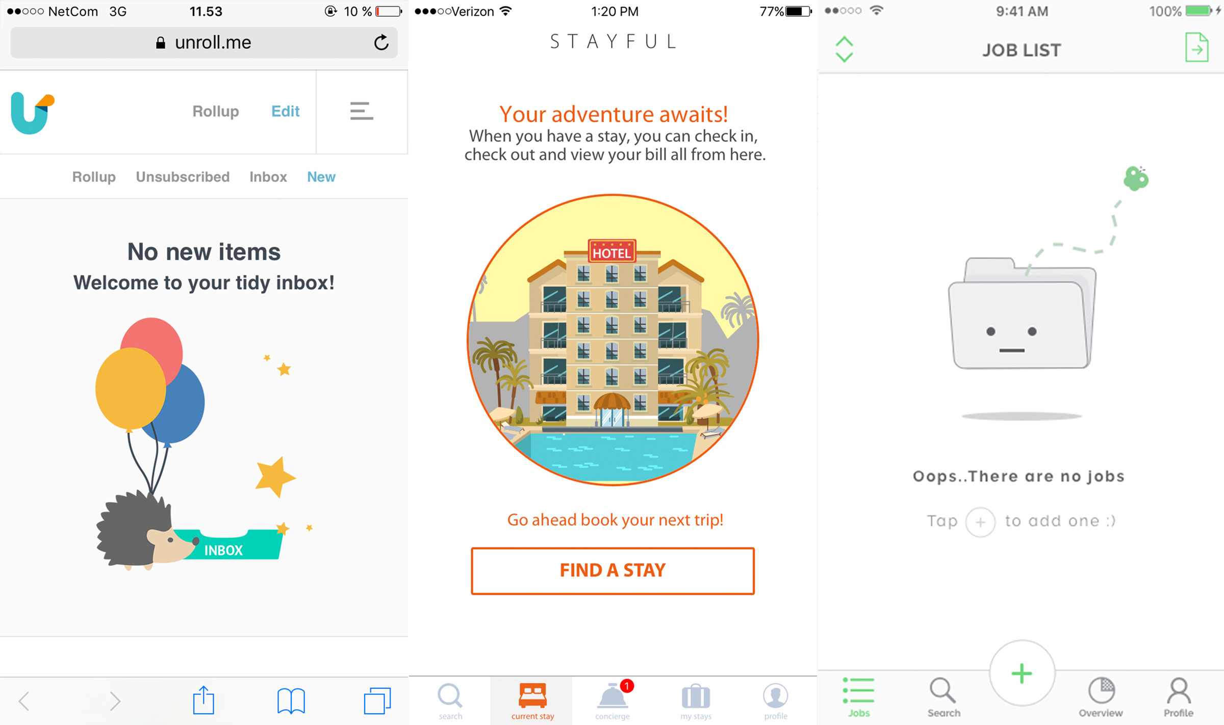
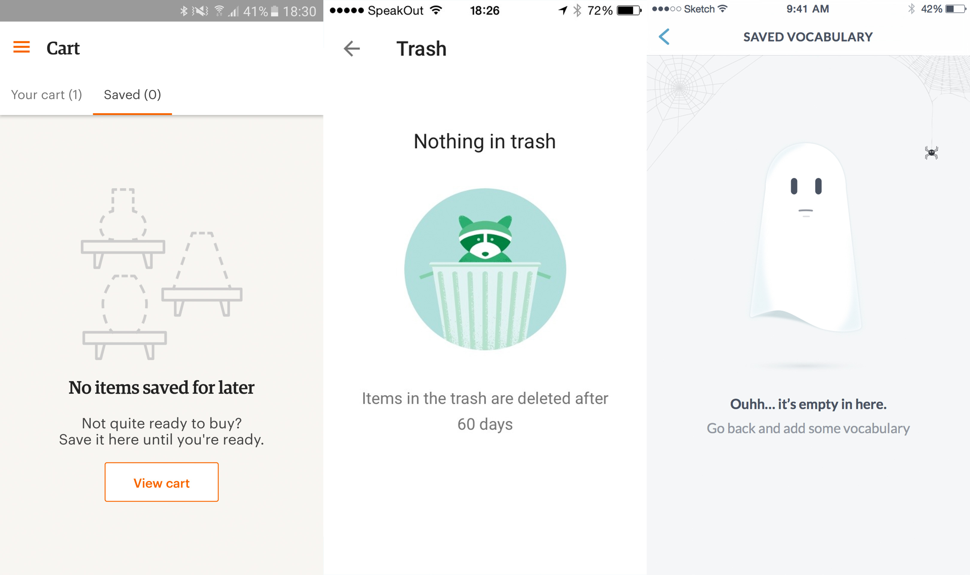
The website emptystat.es is a collection of user submitted empty states from desktop and mobile apps. Below is a collection of a few of my favorites from the site along with an empty state design I created for a mobile food ordering app.


